An e-commerce website is an online shopping destination where users can purchase products or services from your company.
A robust e-commerce web page makes it easy to browse products, filter by categories, highlight special sales and make purchases. An easy way to get started is through a full-solution, e-commerce platform like Shopify or Squarespace. Your team can easily update online inventory and list new products. Plus, because the system is interconnected, sales, logistics and marketing are all kept apprised on what’s working well. On the design front, e-commerce platforms offer several templates that match the needs of nearly any business type.

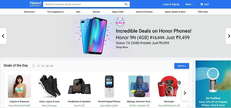
Flipkart sells a wide range of products, which means there are a lot of items featured on their homepage. Note how they break items into specific categories but also offer highlighted deals of the day on their homepage. Each image is professional and shows the product clearly, but descriptions are initially brief, with more detail on the product page.
3. Blogs:-
A blog features regularly updated articles, photos and videos. Blogs started with more casual, personal content compared to magazines. But since then, the lines have blurred, and now it’s extremely common for major brands and businesses to have their own blog. Adding expert content improves the overall credibility of a company or an individual. Blogs also provide material for social media posts and email campaigns.
However, a blog can also become cumbersome for smaller companies. Make sure you have a team and strategy in place to keep content fresh before you consider launching one. It’s actually better not to have a blog and instead offer a few videos or guides, than to have a hopelessly outdated blog.

Nourish Eats keeps things simple and focused on the content on its blog. Instead of using a slider at the top of the page, the site integrates a rotating slider to the right, which goes through the different categories on the site. The slider keeps the content fresh and engages users. Users can navigate at any point or use the arrows to go forward or back.
A landing page is a specific page type created for a marketing campaign that drives visitors to take a specific action.
The content on a landing page should be limited and point toward the call-to-action (CTA) you’d like the user to take. Allow plenty of white space around your CTA and save elements not related to the purpose of that campaign for other pages.

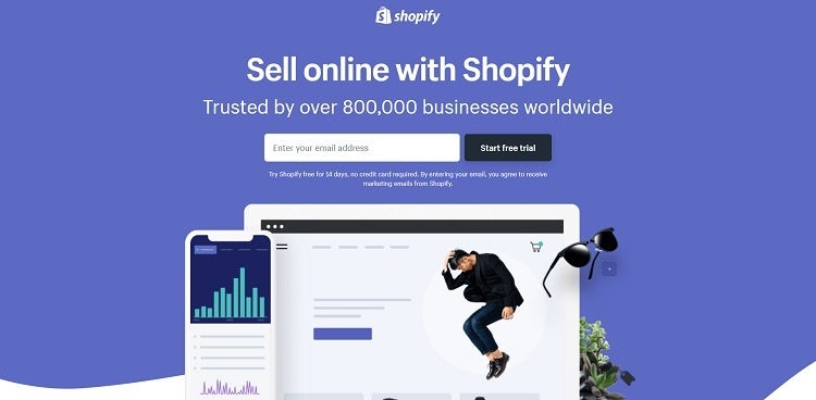
Shopify’s free trial landing page provides simple headlines and calls to action, such as “Start free trial.” All the elements on the page drive the buyer through a very specific journey meant to have them become a qualified lead. They use relevant, trendy images and add a bit of a 3D effect with the sunglasses in the corner while also showing what one of their shopping sites layouts looks like.
5.Social media websites:-
Go for a consistent look across all your social media pages and web pages, so users instantly know your brand is behind the page. Use the same logo and color choices. Choose a specific voice and personality that shines across all content.
When creating content, focus on things that have a high potential of being shared on social media, such as entertaining videos, infographics, memes, in-depth reports and free offers.

Nutella’s Facebook page shows an interesting mix of content that all align with the overall color palette and look of the brand. They feature memes made specifically for social media, such as “Today, I’ll share my Nutella with…” However, they also offer videos and ideas for how to use their product in unique ways. Note how they also feature social media buttons on their website so users easily find them on the different platforms.


إرسال تعليق